Struggling to make your brand pop in the vast sea of the internet? You’re certainly not sailing those waters alone. Like a crowded marketplace, the online world is bursting at its seams with brands vying for attention, each hoping to be the one that sticks in people’s minds.
Trust us, we’ve navigated these turbulent waters ourselves—trying to plant our flag on unclaimed digital territory amidst a sea of competitors was no easy feat.
Through our journey filled with trial and error, we gathered invaluable insights on how to etch out a distinct space for your brand across all digital platforms. One critical lesson became crystal clear: cohesive branding transcends pretty visuals; it’s about weaving your brand’s core values and unique personality into every piece of communication you put out there.
This guide is here to walk you through building a robust, harmonious brand identity that not only connects deeply with your audience but also distinguishes you from the crowd. Ready for some hands-on advice? Let’s dive right in!
Key Takeaways
- Cohesive branding tells the world who we are and sets us apart. It involves using consistent logos, colors, and imagery across all digital platforms. This strategy makes people feel a special connection to our brand.
- A strong logo and color palette play big roles in cohesive branding. They make our brand memorable by evoking certain emotions. We carefully choose these elements to tell our story and connect with our audience.
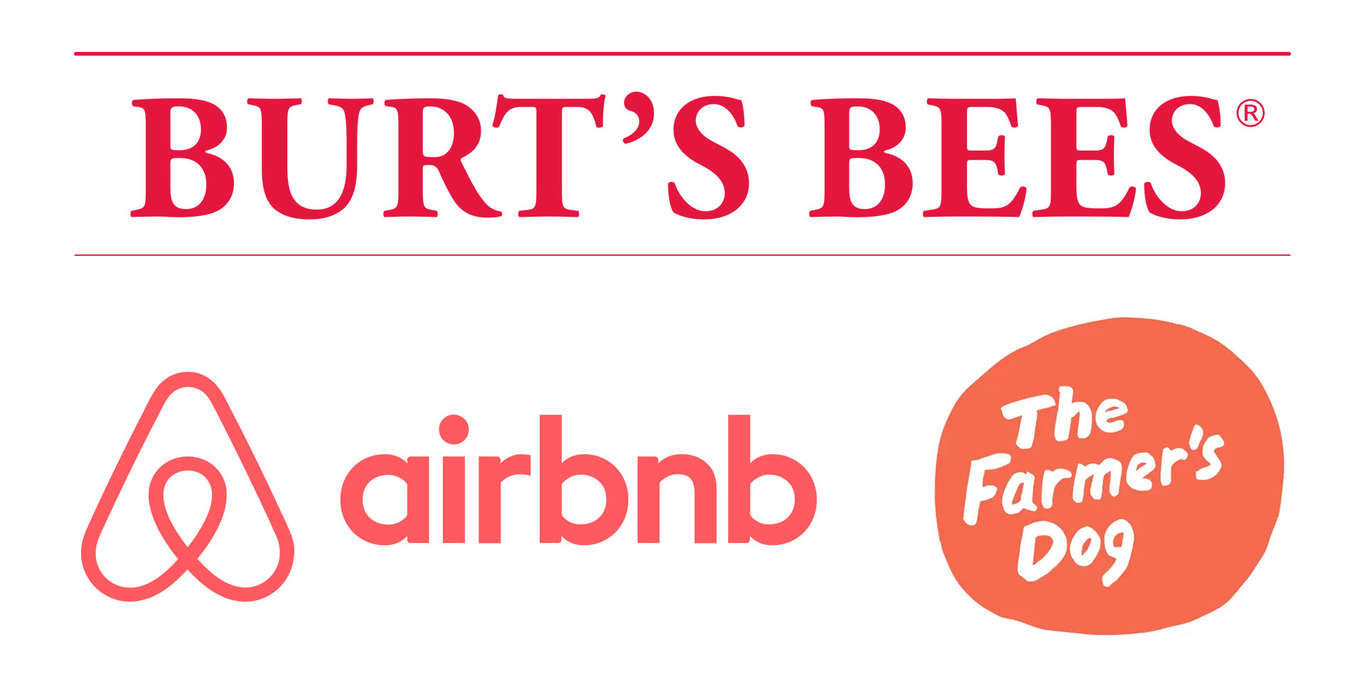
- Success stories like Airbnb, Burt’s Bees, and The Farmer’s Dog show the power of cohesive branding. These brands stand out by sticking to one clear concept across all online channels, building loyal followings.
- Avoiding common mistakes is crucial for effective online branding. Being specific about what makes our brand unique helps us avoid blending into the background. Maintaining consistency across platforms is key to avoiding confusion and strengthening identity.
- Crafting a compelling brand statement is vital in defining what sets your brand apart. This statement guides all aspects of the strategy, ensuring every content piece resonates with purpose and connects deeply with the target audience.
Understanding Cohesive Branding
Cohesive branding tells the world who we are, setting us apart from others. It’s the vibe our brand sends out, drawing people in and making them feel something special. Think about giants like Apple and Coca-Cola.
They’ve mastered this art, creating a cult following simply by being consistent across all touchpoints — from their logos to advertisements on social media platforms. This isn’t just about looking good; it’s about evoking emotions and building trustworthiness with every tweet, email marketing campaign, or Instagram post.
We dive deep into understanding our unique identity by asking vital questions: Who are we? What sets us apart? Why do we matter to our target audience? Answering these shapes our cohesive branding strategy, ensuring that everything from the color scheme of our website design to the tone of voice in communications reflects our vision and integrity.
Major brands leverage tools like Adobe to design captivating graphics and Kajabi to share their stories effectively online — empowering them to leave a lasting impression on customers’ hearts and minds.
Elements of a Cohesive Brand Identity
Crafting a cohesive brand identity means choosing elements that speak your brand’s language. It’s about picking the right logo, colors, and imagery that tell your story at a glance.

Logo
A logo serves as the face of our brand. It’s what people notice first and remember most. We ensure it tells our story, embodies our values, and stands out in a crowded digital space.
For this reason, we focus on typography that resonates with our audience—whether it’s the clean lines of sans-serif fonts like Arial or Helvetica for a modern look or something more unique to capture attention.
We also weave color psychology into its design, picking hues that evoke the right emotional responses from viewers. This isn’t just about looking good; it’s strategic, aiming at making a lasting impression on anyone who sees our logo online.
With every aspect carefully considered—from shapes to colors—we craft logos that not only define us visually but also connect emotionally and psychologically with potential customers across all platforms.
Brand Color Palette
Choosing the right brand color palette is crucial. It sends a powerful message. Colors impact feelings and decisions. They play a huge role in creating our brand’s look and feel. We take color psychology seriously.
It helps us convey the right impression and evoke specific emotions. Whether it’s trust, excitement, or calmness, each color has its purpose in our branding strategy.
We carefully select colors that resonate with our audience. This ensures consistency across all platforms – from our website landing page to social media marketing campaigns. Our goal is to make sure when you see certain colors, you immediately think of our brand.
This consistency boosts brand recognition and builds credibility over time.

Imagery & Icons
We understand the power of visuals in creating a brand identity that sticks. Images and icons are not just decorations; they communicate your brand’s unique qualities and values at a glance.
By carefully selecting each image and icon, we make sure they align with what your business stands for. This strategy helps set us apart from competitors and builds a strong, memorable brand image.
Our approach to using imagery and icons involves incorporating elements that resonate with our target audience while staying true to our brand tone. We focus on connecting emotionally through visuals, whether it’s through the warmth of our colors or the friendliness of our icons.
It’s all about making every visual element work towards enhancing user engagement and reinforcing brand awareness. Visuals have the power to tell stories more effectively than words alone—this is why we pay close attention to the imagery and icons that define us online.
Shapes
Shapes play a vital role in creating a visual identity for our brand. They can make our message clear and memorable. Circles suggest community and unity, squares indicate stability, and triangles convey power.
By selecting shapes that align with our brand’s values, we solidify our presence in the digital marketplace.
Incorporating these shapes across all platforms ensures consistency. This strategy is crucial for reinforcing our brand’s look and feel, from social media campaigns to web design. Our careful choice of shapes helps evoke specific feelings and conveys important messages about innovation, reliability, and user experience seamlessly.
How to Create a Cohesive Brand Strategy
To craft a cohesive brand strategy, we dive deep into pinpointing what sets your brand apart. We then articulate this uniqueness through a compelling brand statement that resonates across all platforms.
Differentiating your brand in the marketplace
Standing out in the marketplace means being bold and innovative. We focus on creating a unique brand identity that resonates with our audience’s desires and values. Using the power of storytelling, we weave your brand’s narrative into every aspect of digital marketing – from typographic choices on your website to the lifestyle images shared on Pinterest.
This approach not only differentiates you from competitors but also builds a deep connection with your followers.
We leverage color psychology, empowering imagery, and impactful calls to action to make your brand unforgettable. Consistent messaging across all platforms ensures that whether customers see your logo on an iPhone or read about your eco-friendly products, they instantly recognize it’s you.
Major companies like Apple have mastered this art, achieving a cult following by being consistent yet innovative in their branding efforts. Following these strategies can set you apart in a crowded digital space and drive loyalty among users who value sustainability, empowerment, and innovation.
Formulating your brand statement
Crafting your brand statement is a pivotal moment in shaping your identity. We dive deep into understanding exactly who we are and what sets us apart, pinpointing our uniqueness. It’s about clarifying not just what we do but highlighting its significance.
This process reveals whom we serve and the vital role they play in our ecosystem. Our mission becomes crystallized through this journey, ensuring every piece of content creation resonates with purpose.
We pose three essential questions to guide us: Who are we? What makes us special? Why does what we offer matter? The answers become our north star, directing all aspects of our strategy—from web design to how we package ourselves as a lifestyle brand.
This isn’t just about finding the right words; it’s an excavation of our core values, translating them into a language that connects deeply with our audience. Through this meticulous crafting of our brand statement, every touchpoint becomes a reflection of who we are, promising consistency that builds trust and loyalty.
Developing your brand’s look and feel
We dive deep into the essence of your brand, asking key questions about what you stand for and aim to be recognized for in your industry. This critical step lays the groundwork for crafting a brand identity that truly resonates with your audience.
It’s all about making informed choices – from selecting your logo to deciding on a color palette that employs color psychology effectively. These elements work together to evoke specific feelings and convey a memorable impression.
Selecting imagery, icons, and typography further amplifies this process, establishing a visual language that speaks volumes about your brand’s personality. We leverage these components to weave a cohesive narrative around your products or services – whether it’s through sleek web design that catches an iPad user’s eye or packaging that makes dog food more appealing.
Everything is meticulously designed to align with the core values and message you wish to communicate, ensuring every touchpoint reinforces your brand’s look and feel.
The Importance of Consistency in Online Branding

Maintaining consistency in online branding lets us make a lasting impression on our customers. Every touchpoint, from the website to social media posts, needs to showcase our brand’s colors, typography, and logo uniformly.
This strategy not only strengthens our identity but also assures customers they’re engaging with the same trusted brand across different platforms. Think of it as giving our brand a voice that speaks the same language everywhere it appears.
Our efforts in creating a consistent online presence help build a loyal customer base and fortify our brand following. Imagine scrolling through an iPod filled with songs – each track represents varied information yet belongs unmistakably to one album; that’s how we want our branding to feel across all online channels accordingly.
All in all, achieving this level of cohesion differentiates us in the marketplace, turning first-time viewers into long-term followers who resonate deeply with what we stand for.
Avoiding Common Mistakes in Branding
We often see businesses trip up by using generic phrases that blend into the background. In our journey, we’ve learned that specifics matter. Your brand needs to shout about what makes it unique.
It’s not just about having a sleek logo or a catchy tagline. Every aspect of your brand identity, from colors and shapes to typography, should tell your story with precision. Using tools like Kajabi can turn these elements into an engaging online presence, distinguishing you in a crowded marketplace.
Another common mistake is inconsistency across platforms which confuses audiences and dilutes brand impact. We ensure every web designer on our team knows the importance of uniformity—from the style of illustrations to the tone in blog posts.
Finally, a consistent brand builds trust and keeps people coming back for more. Think about brands like Airbnb; their seamless experience across different touchpoints is no accident but the result of meticulous planning and execution.
Examples of Successful Cohesive Branding
We’ve seen brands like Airbnb and Burt’s Bees transform the marketplace with their distinctive identities. The Farmer’s Dog has also made a significant impact, proving cohesive branding isn’t just effective—it’s essential.

Airbnb
Airbnb stands out as a master of cohesive branding in the online world. By centering their entire brand identity around one concept, they’ve created a strong, consistent message that resonates across all channels.
Their success lies in how seamlessly they weave this identity into every detail—from the website design to customer interactions. This dedication to consistency has not only set Airbnb apart but also built a loyal following.
Their strategy showcases the power of focusing on a singular idea and executing it with precision across all platforms. Airbnb’s approach proves that when you infuse your brand identities into every aspect of your product, you create an experience that sticks with people long after their interaction ends.
This level of integration between brand and consumer experience is what makes Airbnb a go-to example for successful online branding.
Burt’s Bees
Burt’s Bees stands out for its exceptional approach to cohesive branding. Its identity revolves around a clear, single concept – natural personal care products. This focus ensures every message and visual connects directly back to their core mission.
Their success isn’t by chance; it’s the result of meticulously consistent messaging and presentation across all online platforms.
The brand masters the art of creating a recognizable presence in a crowded market. By weaving their commitment to sustainability and natural ingredients into every aspect of their branding, Burt’s Bees has built a loyal following.
Nonetheless, this strategy showcases not just products but values that resonate deeply with their audience, proving we can create powerful connections through consistency and clarity in our brands’ identities.
The Farmer’s Dog
The Farmer’s Dog nails it with their online branding. They’ve built a powerful identity around a clear, single concept—healthier food for dogs. This brand does more than just sell dog food; they promise a healthier, happier life for your furry friends.
Every touchpoint of their brand, from the website to social media, echoes this commitment. It shows in their consistent messaging and clean presentation.
They ask simple questions that resonate deeply with pet owners: What if you could extend your dog’s life by feeding them better? Then, they deliver answers through every part of their brand strategy.
The Farmer’s Dog doesn’t just talk about quality ingredients; they make it their mission statement loud and clear across all channels. This unified approach sets them apart in the crowded pet market and defines them as experts who care deeply about pets’ well-being.
Conclusion
We’ve explored the pillars of creating a cohesive online brand, from your logo to your color palette. Implementing these elements is straightforward and highly effective. How will you apply them to make your brand stand out? Remember, consistency in branding can significantly boost recognition and loyalty among followers.
For deeper insights, consider delving into additional resources on successful brands like Airbnb and Burt’s Bees. Imagine the impact a unified brand identity could have on your business’s growth.
Let’s embark on this journey together; after all, a strong brand is the foundation of success in today’s digital world.
FAQs
1. Why is having a consistent online brand important?
A consistent online brand builds trust and makes your business memorable to customers.
2. How can I create a cohesive brand identity across all platforms?
Use the same logo, colors, and messaging on all online platforms to ensure your brand looks unified.
3. What’s the first step in developing an effective online branding strategy?
Start by defining your unique selling points and target audience for a clear direction in your branding efforts.
4. Can changing my website design affect my brand identity?
Yes, updating your website design can refresh your brand identity, making it more appealing to current trends.
5. How often should I update my online branding materials?
Review and possibly update your branding materials at least once a year to keep them fresh and relevant.


