Fonts are integral to design, giving letters and words feeling and meaning. Yet, selecting a typography for a logo or website is never just “picking a font.”
Every typeface carries tone, history, and intention. It shapes how a brand feels before a single word is read. The right font can communicate authority, warmth, precision, heritage, or innovation at a glance. On the other hand, using the wrong one can detract from and diminish its intended delivery. That’s why typography in design should be treated as a strategy, not simply decoration.
Behind the typography you see every day is an origin story. There is a type designer who sketched the first characters. A font foundry that refined, published, and licensed the work. There are endless decisions about spacing, weight, readability, and usage that most people never notice but always feel.
If you’ve ever seen one of our #FontFriday posts on Instagram or LinkedIn, you already know we revere the beauty of typefaces. It is our way of celebrating the designers and foundries who shape what we experience every day, likely without even noticing.
Consider this blog an outlet for our obsession. We’ll explain what font foundries are, how typography evolved from physical type to digital systems, and why certain names like Helvetica and DIN keep appearing in design conversations. Hopefully, you’ll come away with an understanding of how fonts influence branding and credibility. And more importantly, why we are so meticulous in our selection during the design process.
We hope you enjoy learning. Once you understand the story behind a typeface, you’ll never see fonts the same way again.
What Is a Font Foundry?
A font foundry is a company that creates, publishes, and licenses typefaces. Simply put, it’s the organization responsible for bringing a font to life and making it available to designers and the public.
Font foundries matter because they protect craft and ensure quality. They also manage licensing and preserve consistency across brands and platforms. When designers choose a typeface, they are selecting more than “a style”. They’re choosing the work of a specific creator and the standards of a specific foundry.
A Brief History of Font Foundries

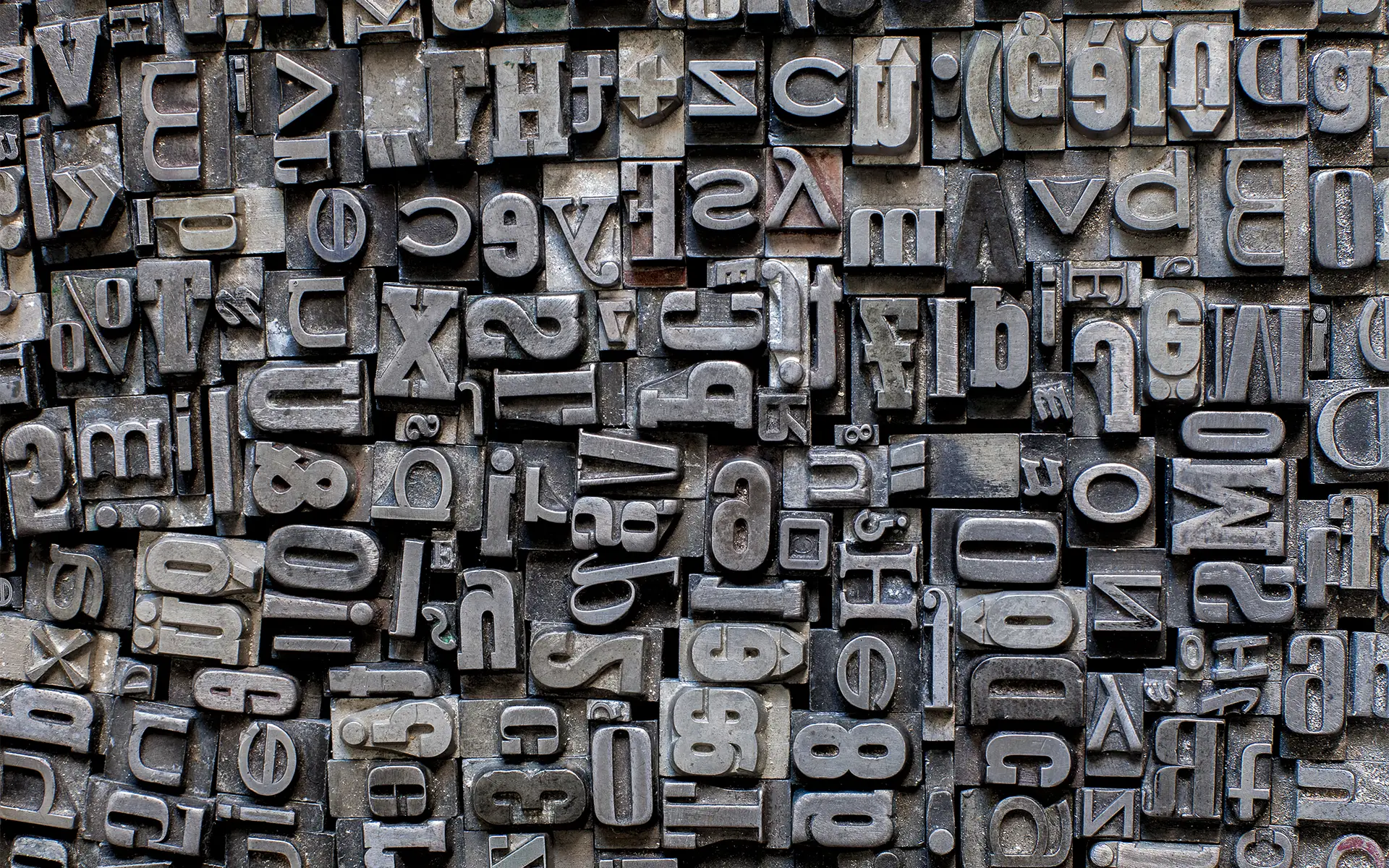
Long before fonts were just something selected from a document dropdown menu, they existed as physical objects. Traditional type foundries produced metal and wood plates for printers. The work was tedious, as each letter was cast, set by hand, inked, and pressed into paper. Printers stored drawers filled with characters, carefully organized and reused across publishing. In those days, the craft required precision, patience, and deep technical knowledge.
By the early twentieth century, foundries were industrial operations. They designed typefaces, cast the physical letters, and distributed them to print shops. Although typography became more mechanical, it was still deeply human. Every curve and serif was intentionally shaped for legibility and durability.
Naturally, things changed with the digital age. As publishing moved from print shops to computers, type transitioned from metal and wood to digital files. Instead of casting letters, designers began building them with vector outlines. Foundries began distributing software instead of shipping crates.
Though it all, the role of the foundry didn’t disappear. It evolved. Modern independent foundries now operate as digital publishers. They collaborate with type designers, expand font families into multiple weights and styles, test functionality across operating systems, and manage global licensing. Many are small, highly specialized studios focused on craftsmanship and originality. Others operate at a larger scale to serve international brands and creative agencies. Despite the technological shift, the foundation remains the same. Foundries exist to develop, refine, and protect type. So, the tools changed, but the intention did not.
And while most typography today is digital, the influence of letterpress roots is still visible. Designers continue to seek texture, authenticity, and tactile warmth in their work. Historic print shops like Hatch Show Print in Nashville built their identity around bold, expressive letterpress typography. Their posters, created with hand-set wood type, celebrate how handcrafted design can produce striking, timeless results. The texture, pressure, and ink spread of letterpress printing created a visual character that digital tools still try to replicate today.
Font Foundry vs. Type Designer vs. Distributor
Although they’re distinct entities, the font foundry, designer, and distributor shape the typography used today. The world of fonts is built on their collaboration, each playing a distinct role. Understanding who does what helps make sense of modern font development, access, and why some types are more widely recognized than others.
Type Designers
Think of the type designer as the creative mind behind a font. Designers craft the letters, refine spacing, and build the full character set. Some work independently, while others are part of a team. Take the two iconic fonts, Heveletica and DIN. Whereas Helvetica was created by a single designer, DIN was developed by a foundry team.
Font Foundries
Foundries work closely with designers to refine fonts. Their work includes testing typefaces across platforms, managing the technical standards, and securing licensing. A foundry ensures the font maintains quality and consistency across print and digital. In many cases, the foundry is as well known as the individual designer, which is why certain foundry names are consistently recognized in design circles.
Font Distributors
The font distributor is the marketing/sales arm of the typography business. Distributors like MyFonts and Adobe Fonts license and sell fonts, making them accessible to users worldwide. Distributors typically don’t create or modify fonts, but they connect buyers with designers and foundries.
Why Some Fonts Keep Coming Up
Fonts like Helvetica and DIN are commonly used because they are well-crafted, widely licensed, and supported by respected foundries. Their popularity is an example of how these three entities work together, from design to steward to distributor, to ensure typefaces remain relevant across decades, industries, and design trends.
Understanding Font Types
Not all fonts are created equal. There are different categories of typefaces, each serving a different purpose. Understanding the basics can help explain why designers make the choices they do. Here’s a quick primer on the major font types, what they are, and when designers use them:
Serif
- What: Fonts with small lines or “feet” at the ends of characters.
- When: Serifs are widely used in print materials, editorial design, and branding for a classic, trustworthy, or sophisticated feel. The added strokes can improve readability in long blocks of text.
Examples:
- Times New Roman
- Garamond
- Georgia


Sans Serif
- What: Clean, modern fonts without decorative strokes or “feet”.
- When: Sans serif fonts pair well with digital interfaces, branding, and signage for their clarity and minimalism. They communicate modernity, simplicity, and approachability. For example, Helvetica is what you see on most street signs.
Examples:
- Helvetica
- Arial
- DIN


Display
- What: There are highly stylized fonts meant to stand out at large sizes, like headlines or posters.
- When: Display fonts are used sparingly to grab attention, set tone, or create visual impact. They are busier, therefore not meant for long paragraphs.
Examples:
- Impact
- Bebas Neue
- Lobster


Script
- What: Script fonts mimic handwriting or calligraphy, ranging from elegant cursive to playful, informal lettering.
- When: These fonts convey personality, creativity, and emotion, and are often used for invitations, logos, or decorative accents.
Examples:
- Brush Script
- Pacifico
- Lobster (the script variant).


Monospace
- What: These are fixed-width or non-proportional fonts where every character occupies the same horizontal space.
- When: Monospace is commonly used in coding, technical documents, or retro/industrial designs. The uniform spacing creates a precise, structured look.
Examples:
- Courier
- Consolas
- Fira Code

Letterpress Fonts and Their Influence on Modern Design
Before fonts were downloaded, they were handled. Each character of letterpress fonts was individually cast, arranged by hand into a form, inked, and pressed into paper. The result was a tactile impression, where one could actually feel the letters’ impressions on the page.
Beyond the beauty of its weight and texture, letterpress type had limitations. At the time, printers worked with what they had on hand. Inevitably, letterpress types wore down with use, the ink tended to smear a bit, and the pressure varied. Yet, it’s those imperfections that defined the aesthetic.
In a world of perfectly smooth digital graphics, what was once considered limiting is what makes letterpress fonts stand out: their texture and imperfections.
When branding calls for craftsmanship, heritage, and credibility, letterpress fonts deliver. Their slight ink variations, subtle distressing, and strong, condensed letterforms suggest something handmade and considered. In today’s world, they represent effort and something tangibly real.
That is why designers frequently reference letterpress when creating modern brand identities, especially for companies that want to emphasize tradition, quality, or grit. Letterpress-inspired doesn’t mean they are setting the type physically. Rather, it refers to digital fonts that mimic the character of wood or metal type. Common features include:
- Slightly imperfect edges
- Bold, condensed forms
- Vintage proportions
- Textured or distressed styling
Even in fully digital environments, the influence of letterpress remains. It reminds us that typography began as a physical craft. And that material sense of the pressure, imperfections, and texture continues to influence branding choices today.
Our Favorite Fonts
Some fonts endure because they are trendy. Others endure because they are built with intention. Our favored typefaces continue to appear in branding, design, signage, and digital experiences because they solve real design problems. Each is versatile, legible, and timeless.
Helvetica
Helvetica was released in 1957 in Switzerland during the rise of the International Typographic Style. Originally named Neue Haas Grotesk, it was later renamed Helvetica for Helvetia, the Latin name for Switzerland. Developed by Max Miedinger (with input from Eduard Hoffmann) and released by the Haas Type Foundry, Helvetica was designed to be neutral, clear, and highly legible. Today, it’s managed by powerhouse Monotype.
Helvetica is everywhere, thanks to its neutrality. It does not demand attention, which makes it incredibly adaptable. Its clean structure and balanced proportions allow brands to communicate clarity and confidence without stylistic distraction. We see Helvetica on public signage, corporate branding, editorial layouts, web design, and more. From transit systems to tech companies, Helvetica remains a default for modern print and execution.
DIN or FF DIN
Hailing from Germany in the early twentieth century, DIN is an industrial standard typeface used for road signs, engineering drawings, and technical documentation. It was not originally created as a branding tool, but as a standardized lettering system. In the 1990s, designer Albert Jan Pool expanded and refined the typeface into FF DIN, adapting it for contemporary design use. Originally released through FontFont, it’s now part of Monotype.
DIN evokes precision and efficiency. Its geometric construction and industrial roots give it a technical, authoritative tone. Yet, its clean lines make it feel modern and adaptable. We see DIN in sports branding, automotive industries, editorial headlines, packaging, and digital interfaces.
Brothers
This display typeface is inspired by vintage wood type used in nineteenth-century posters and advertising. Its condensed forms and bold personality reflect the energy of early letterpress printing. Brothers was designed by John Downer and released by Emigre, an influential independent digital type foundry known for pushing typographic boundaries.
The Brothers font has character. It feels handcrafted, expressive, and rooted in print history. It’s a go-to when designers want personality and presence without sacrificing readability at large sizes. We see it with packaging, restaurant brands, posters, merchandise, and headlines. It is especially effective for projects inspired by heritage, craftsmanship, or Americana aesthetics.


Why Font Choice Matters in Branding
Typography helps define a brand’s voice. It can give words a feeling. A refined serif signals heritage and credibility, while a clean sans serif communicates clarity and innovation. Then there’s a bold display font, which evokes confidence and energy. Although subtle, these signals are powerful. Fonts influence how professional, established, modern, or approachable a brand feels. When typography aligns with brand values, it reinforces trust. However, when it conflicts, it creates friction.
The Risk of Default or Overused Typography
Overused or generic typography can make a company blend into the background. Although it may not actively harm a brand, it rarely strengthens it. In today’s crowded and competitive marketplace, sameness can be a liability.
Designers must recognize the difference between using a font because it’s timeless, rather than just convenient. Thoughtful selection always beats habit in good design.
Licensing and Sourcing Matter
It’s equally important to consider legality, scalability, and longevity. Proper font licensing protects a business from compliance issues. Also, reliable sourcing ensures the typeface works across web, print, packaging, advertising, and internal systems. As a rule of thumb, Foundry-backed fonts provide technical stability and consistency over time. After all, typography is intellectual property, so using it correctly is part of responsible brand stewardship.
Craft Over Convenience
At Living Proof Creative, typography isn’t an afterthought. It’s highly intentional. We evaluate origin, licensing, technical performance, and brand alignment before recommending a font.
The right choice should look good, align with the brand’s intentions, and reinforce the positioning. It becomes part of the proof behind your brand.
Font Friday with Living Proof Creative
As lovers of all things creative, we tend to geek out over fonts and their stories. That’s why we created our #FontFriday series, which regularly spotlights a new typeface and shares its distinct attributes and history. We invite you to follow along on social (@livingproofcreative) as the series continues to grow. As we grow the series, we will update this blog to include the new fonts and foundries featured. Think of it as a living resource for designers, marketers, and brand leaders who want to deepen their understanding of typography.
Fonts Have Stories. Brands Should Too.
We’ve all emotionally selected a font without realizing it. That dropdown menu offers numerous options to reinforce the intent of the message, from personal emails to PowerPoints and Google Slides decks. Fonts are a decision that affects marketing outcomes. They are a choice that sets an intention or tells a story (often both). The difference between default and deliberate is what separates forgettable from credible within the scope of our branding and design services.
When you understand where a typeface comes from, who designed it, and why it was created, you begin to choose typography with intention that invites trust. At Living Proof Creative, we believe strong brands are built on data and thoughtful details. For us, craft and proof are equally important. Because the best brands, just like the best fonts, are designed with purpose and built to last.