If you have ever felt drawn to a design, building, person, or picture, there’s probably more to the attraction than personal affinity. Likely, the image reflects the Golden Ratio – a mathematical ratio that, when applied, creates visually pleasing, balanced, and aesthetically satisfying results thought to be favored by the human eye. There’s even a coffee golden ratio that baristas swear by! (it’s a 1:17 ratio, BTW – 1 ounce of coffee and 17 ounces of water)
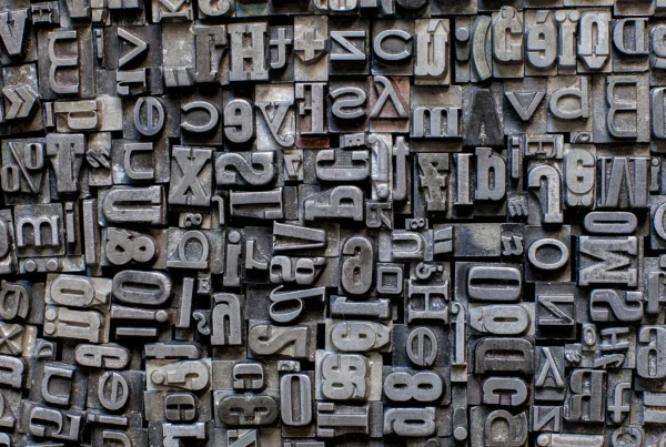
The golden ratio is all about proportion and balance, which is why it’s an essential tool for designers, artists, architects, and other creators. In today’s article, we’re taking a deep dive into the golden ratio phenomenon – i.e., what it is, why it’s important, and how it’s used in UX/UI design. We’ll include plenty of golden ratio examples and visuals since it’s not the easiest subject to explain in written or simple terms.
What Is the Golden Ratio?
The golden ratio (also called the Golden Mean, Phi, or Divine Proportion) is a perfect relationship between numbers. The relationship is so strong that human behavior is drawn to it, and elements of nature are formed by it. In mathematical terms, the Golden Ratio is an irrational number equaling 1.618 or the ratio of two numbers, which is the same as the ratio of the sum to the larger of the two numbers.
If you are more of a right-brain thinker, here’s a helpful illustration of Phi in mathematical terms.
As you can see, (A+B)/A and A/B both equal 1.618, i.e. the Golden Ratio. It’s important to note that since Phi is irrational, the digits following the decimal point can continue going on forever without repeating, i.e. 1.61803398874989484820… and so on.
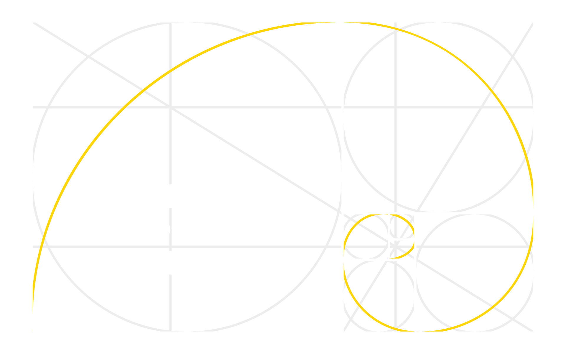
Similarly in geometry, a golden spiral is a logarithmic spiral whose growth factor is Phi, or the golden ratio. That is, a golden spiral gets wider (i.e., further from its origin) by a factor of Phi for every quarter turn it makes. Here’s a helpful illustration:
The golden ratio was first mentioned as early as about 500 BC by Phidias, Plato, and then Euclid, and it has been used throughout history by philosophers, architects, photographers, and designers to create eye-catching, pleasing designs and structures. For example, you may recognize the illustration below, which Leonardo Da Vinci created for “De Divina Proportione” (On the Divine Proportion), a book about mathematics written by Luca Pacioli around 1498 and first published in 1509.
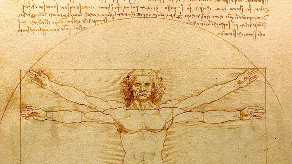
In the book, Pacioli describes mathematical and artistic proportions, particularly the mathematics of the golden ratio and its application in art and architecture.
Over the centuries, scientists have discovered that many ancient buildings and famous artworks obey the golden ratio. However, seeing is truly believing, so let’s look at golden ratio examples in action through art, the human body – even golden ratio in nature – before we get into the significance of the golden ratio in modern UX, web, and app design.
Golden Ratio Examples
Fair warning – once you see how the golden ratio applies to so much around you, it will probably be challenging to un-see it in the world moving forward. You’re welcome.
Golden Ratio in Art
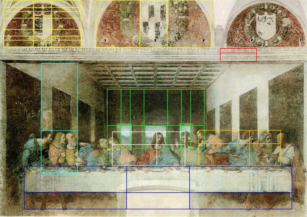
There are many examples of the golden ratio art, but we’ll focus on two of the most famous examples, which are both paintings by Leonardo DaVinci: The Mona Lisa and The Last Supper.
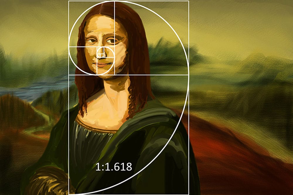
Although DaVinci’s Mona Lisa does not have clear intersecting lines, the golden spiral is evident in his design and placement of the subject’s head and torso.
Similarly, in the Last Supper, principles of the golden ratio are seen in the various design and architectural features of the painting. Some even believe that the positions of the disciples around the table were placed according to the golden mean.
Golden Ratio in Human Body
The golden ratio is a big part of our physical make-up, and it occurs naturally all over the body. For example, let’s take the hand and forearm. If the length of the hand has the value of 1, then the combined length of the hand and forearm has the approximate value of 1.618.
There’s even more evidence of the golden ratio at work in the face. First, the head forms a golden rectangle with the eyes at its midpoint. Also, the mouth and nose are each placed at golden sections of the distance between the eyes and the bottom of the chin. And finally, your teeth. The ratio of the width of the first tooth to the second tooth from the center is – you guessed it, phi!
Golden Ratio in Nature
The golden ratio is abundant in nature. If you think about the golden spiral, where have you seen it outside? Perhaps a snail’s shell or a sunflower? Yes, to both. Let’s think about a cresting wave or a whirlpool. Yes, and yes again. Here’s a good one: a spider web. Ever notice how the size of the squares seems to grow proportionally from the center? That’s the golden mean at play.
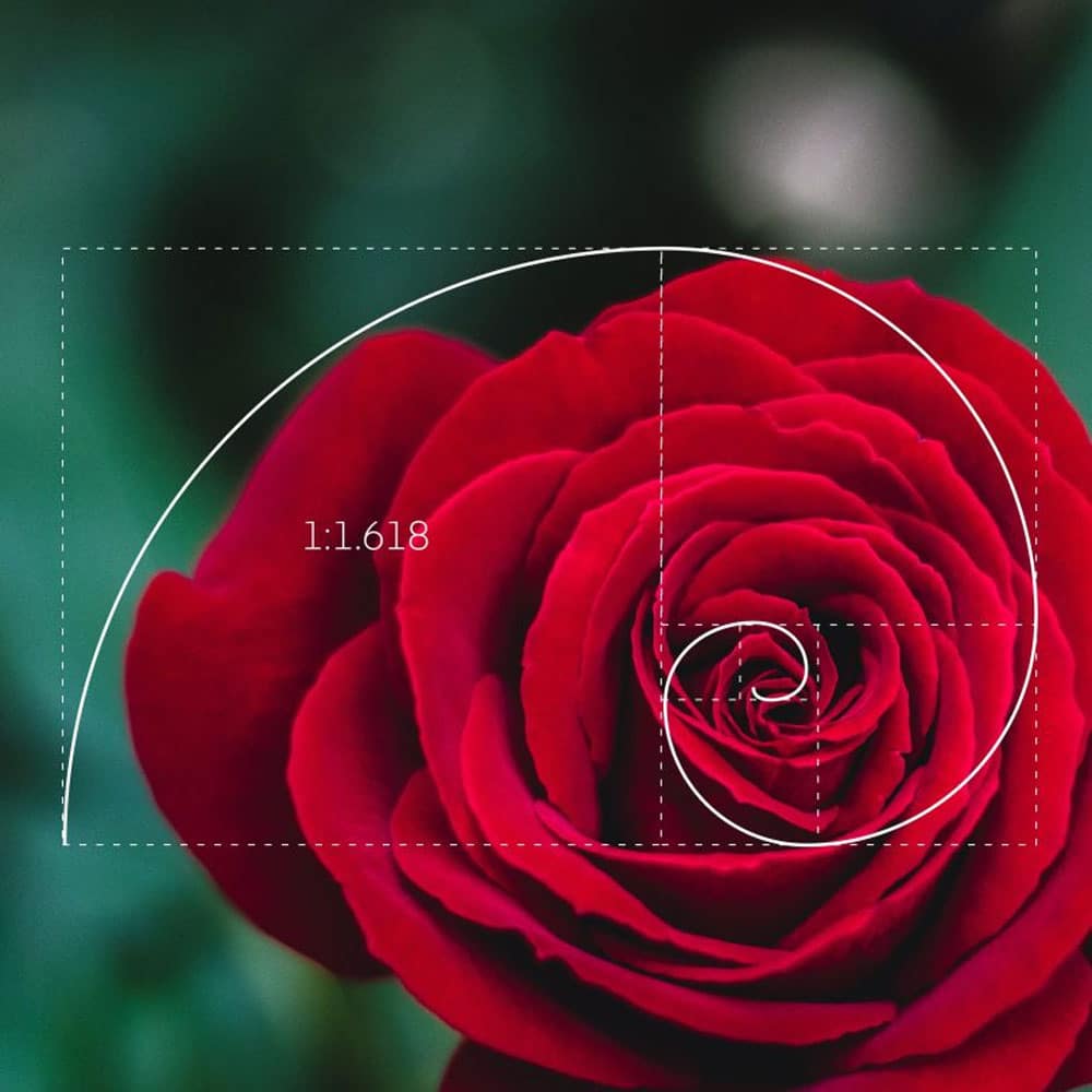
If you are particularly curious, try measuring the distance between petals on a rose in bloom. Studying the rose, you’ll notice that each new petal is the sum of the two petals preceding it. So, if you take the mathematical relationships of any two adjacent rose petals and divide them, they will always come out as 1.618. It’s amazing!
Golden Ratio in Design
Much like in art and architecture, we can apply the golden ratio in digital design to create aesthetically pleasing and balanced designs. The golden mean applies to logo design, web design, app design, and more. For example, the golden ratio is at play in many shapes, such as rectangles, circles, spirals, and triangles. When any of these shapes are brought together correctly, i.e., using the principles of phi, they create beautiful and compelling design elements.
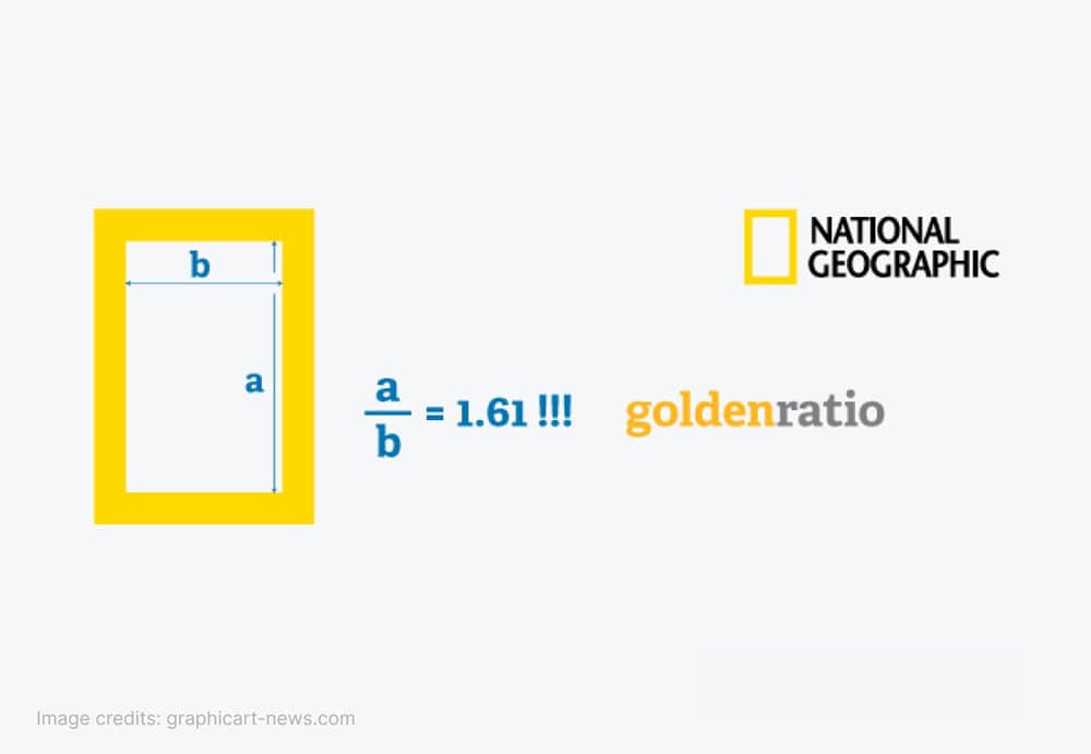
Like nature and art, the golden ratio is everywhere in marketing. For example, National Geographic’s logo demonstrates the golden ratio perfectly – take a look.
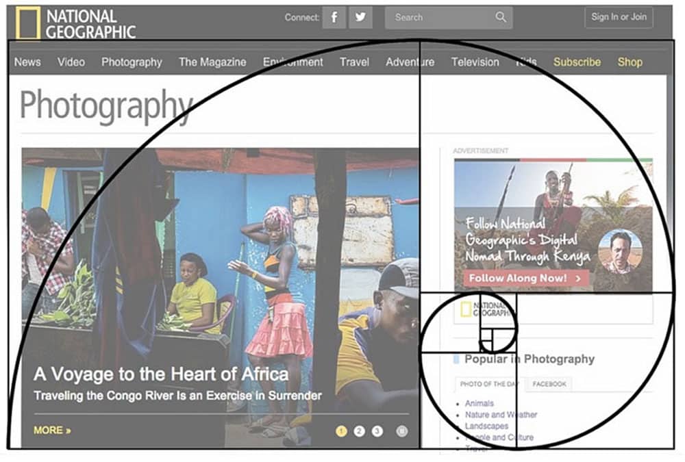
National Geographic also applies the principles of the golden ratio to their website design to create a visually appealing layout that allows the eyes to follow the flow of the information and visuals in a way that feels natural and appealing.
Here’s another of the golden ratio examples you probably never noticed in a major brand logo: Pepsi. Do you see how the logo is formed by several intersecting circles in proportion to one another? The ratio is 1:1.618, i.e., it’s golden.
Golden Ratio App Design
The golden ratio applies to all facets of app design: typography, visual layout, button placement, etc. If your app design is not aesthetically pleasing to the human eye, which the golden ratio accomplishes, it can seriously fall short of performance expectations. App designers need users to engage; a big part of engagement is visual satisfaction and ease of use. Both are qualities that application of the golden ratio design principles can achieve.
For example, pull up any app. Now, if you draw a rectangle on the face of the app, it becomes evident how to place the visual elements. This structure makes it possible to show the most appropriate app and user data on the first screen, thereby making the app’s focal point conducive to any desired actions, like “Save to Favorites” or “Shop Now.”
Golden Ratio Web Design
National Geographic also applies the principles of the golden ratio to their website design to create a visually appealing layout that allows the eyes to follow the flow of the information and visuals in a way that feels natural and appealing. Here’s Nat Geo again – applying the golden ratio to their website design.
A golden ratio web design will draw the user in with a well-balanced page that inspires action. It’s easy to read, easy to navigate, and visually balanced for maximum appeal.
How To Utilize Golden Ratio in UX/UI Design?
The golden ratio is essential to appealing and high-functioning UX/UI design. It can be applied across all elements, like the font size and spacing, image cropping and placement, and much more. Application of the golden ratio in UI design, or UX, will create a positive experience for users while encouraging engagement with well-planned “golden” visual and text elements.
For example, the golden ratio can make website and app text copy much easier to read. Ready to test this theory? If you have a 10pt font for the body copy of a blog post, what size should the headline be for maximum appeal? Let’s apply the golden ratio. First, multiply the body text (10) by 1.618., which gives us 16.18. Now, rounding that down to 16 gives us a 16pt font. The combination of these two fonts is appealing and effortless to read, as it clearly distinguishes the headline from the body copy.
Why Is It Important to Use Golden Mean in
UX/UI Design?
Even if you weren’t familiar with the term “golden ratio” before beginning this article, we’re willing to bet you immediately recognized its significance – and presence all around you. From a brand perspective, applying a golden ratio UX design to your digital assets can elevate your brand identity, engagement, and loyalty.
For example, a golden ratio web design or app design can provide better reading and retention for your brand while increasing user engagement. The golden ratio in design lends an aesthetic balance and appeal to your brand assets that instinctually draws users in and makes your brand more memorable.
Living Proof Creative is a full-service creative agency, and we specialize in handcrafted digital experiences using the golden ratio and other design tools to give brands an edge online and off. Contact us today to discuss how we can create unforgettable brand first impressions and experiences that fuel growth, sales, and – most importantly – cultivate lasting brand loyalty.
Frequently Asked Questions
What is the role of the Golden Ratio in UX/UI Design?
In UX/UI Design, the Golden Ratio can be used to set the dimensions of elements like buttons, forms, text blocks, and images. It can help create a natural flow that guides the user’s eye through the interface in a pleasing, intuitive way, potentially improving user engagement and satisfaction.
Why does the Golden Ratio matter for my brand?
Utilizing the Golden Ratio in your brand’s UX/UI design can contribute to a more harmonious and visually pleasing user interface. This can increase user satisfaction and engagement, ultimately supporting brand reputation and customer loyalty.
How can I apply the Golden Ratio to my website or app design?
You can apply the Golden Ratio in various ways, such as the sizing and spacing of elements, layout composition, and even in the typography. For example, if you have a content block that’s 1000px wide, a visually pleasing division could be a primary content area of about 618px and a sidebar of about 382px, which is roughly in line with the Golden Ratio.
Are there any tools to help me apply the Golden Ratio in design?
Yes, there are several tools available online to help designers apply the Golden Ratio to their designs. Some examples include PhiMatrix and Golden Ratio Typography Calculator. There are also templates and grids available in design software like Adobe Illustrator and Sketch.
Is the Golden Ratio a strict rule in UX/UI design?
While the Golden Ratio can guide designers towards creating aesthetically pleasing and harmonious designs, it’s not a strict rule that must always be adhered to. In UX/UI design, functionality, usability, and meeting the user’s needs are of utmost importance. The Golden Ratio should serve as a tool to enhance these factors, not constrain them.