Once a tiny tex-mex taqueria, Tacos A Go Go swiftly stood out from the other numerous taquerias in Houston for their unique Texas twist on tacos, mixing rockabilly-vibes with Mexican kitsch. Living Proof Creative designed their website and online menu retaining the brands authentic yet alternative ethos.
Overview
User Experience
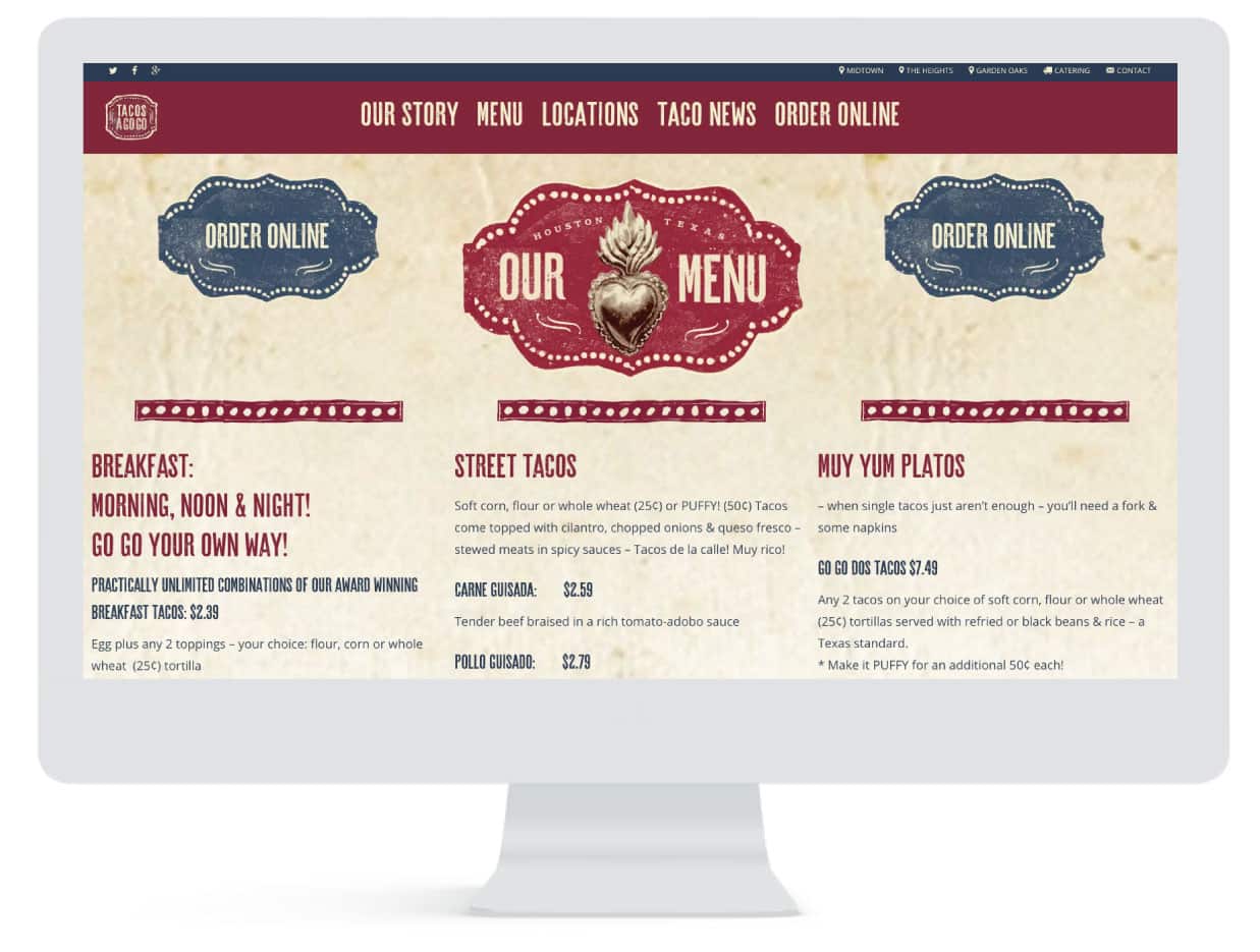
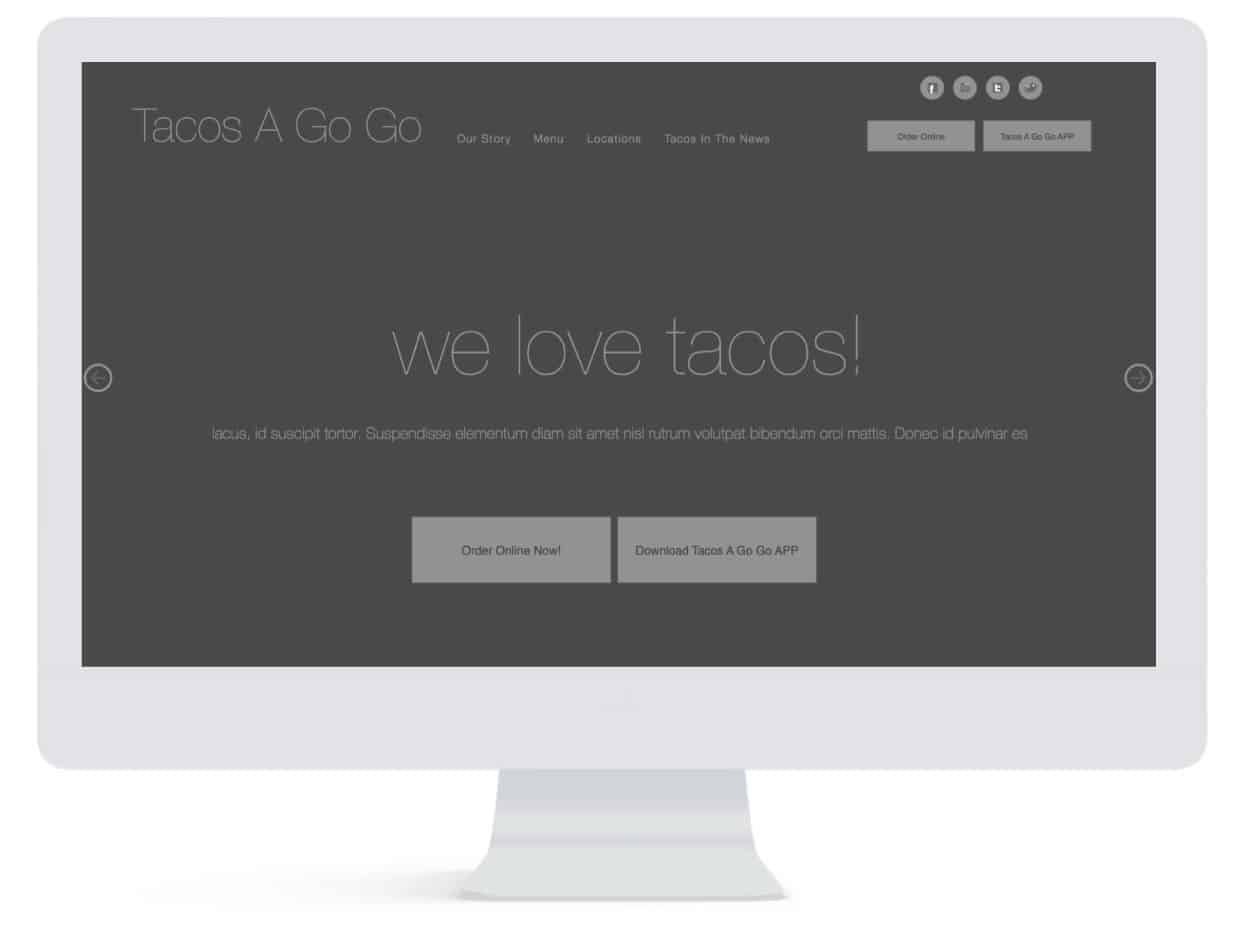
Before building Tacos A Go Go’s website, Living Proof Creative laid out a UX plan encapsulating everything the brand is about. The entire site flows with the laid-back ease. The the interactive menu is located on the landing page so hungry Houstonians can quickly access all the delicious options. It’s smart design will leave you craving a taco and nice cold cerveza!
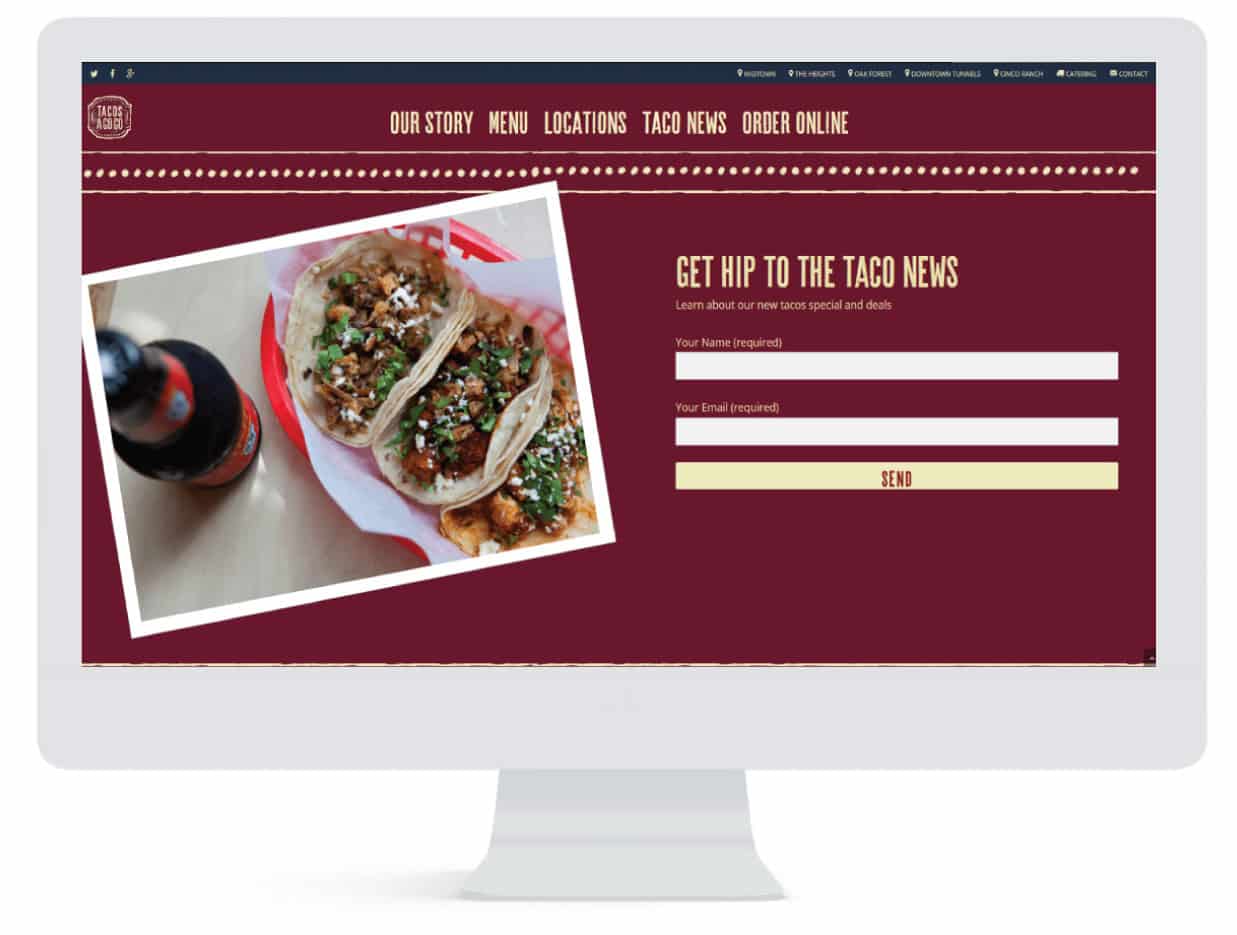
Interface Design
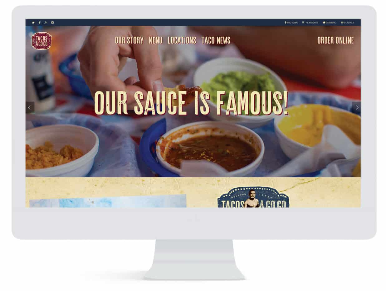
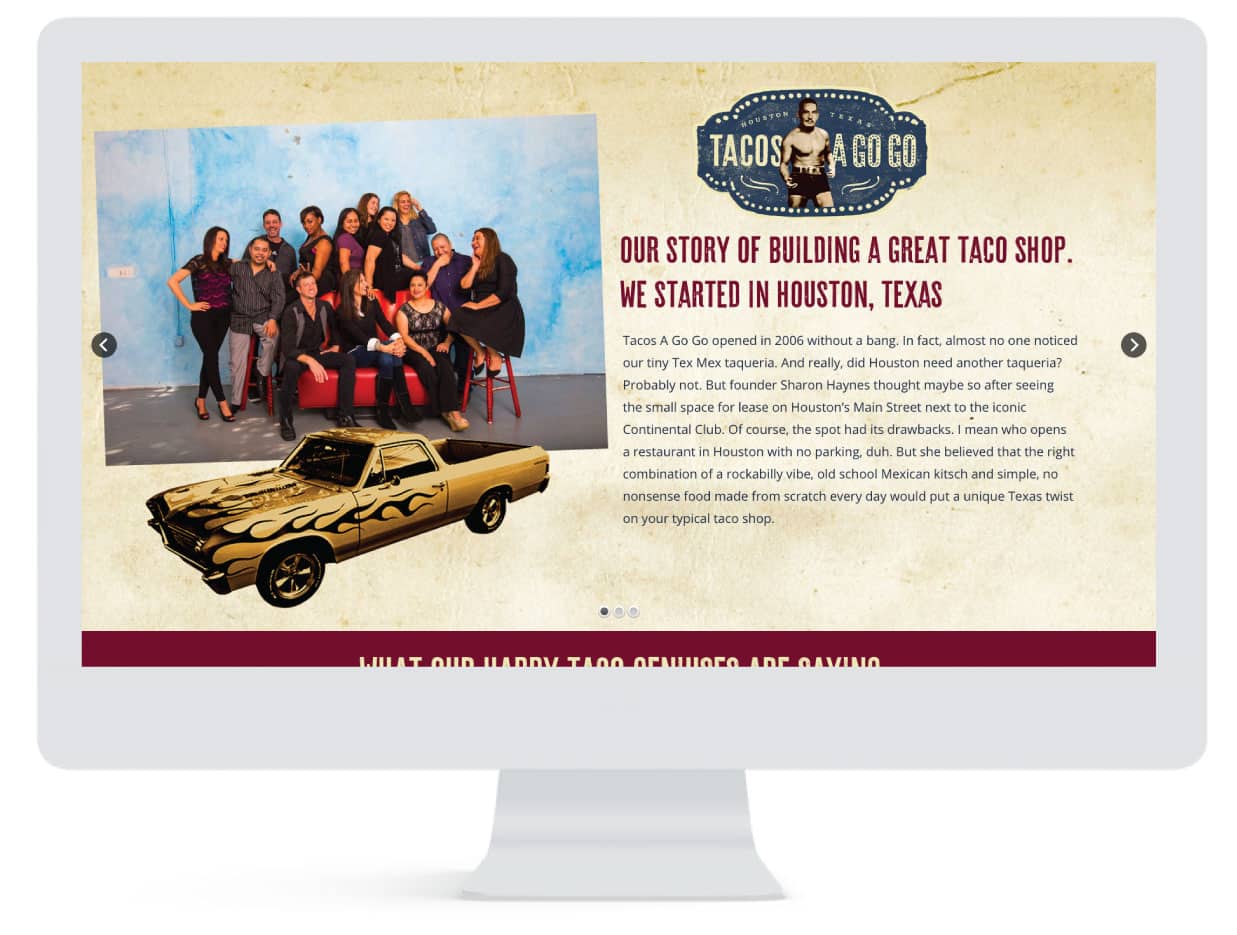
Tacos A Go Go’s rockin’ vibe is palpable when inside any one of their Houston locations. It’s what sets them apart in a town flooded with taco joints. So, this was the inspiration for their website’s Interface Design. Living Proof Creative built the Interface as a direct translation of the brand online. The website’s colors and kitschy details mimic the restaurant’s wild flair, while the high quality images of the food and unique clientele show online visitors exactly what Tacos A Go Go is all about.
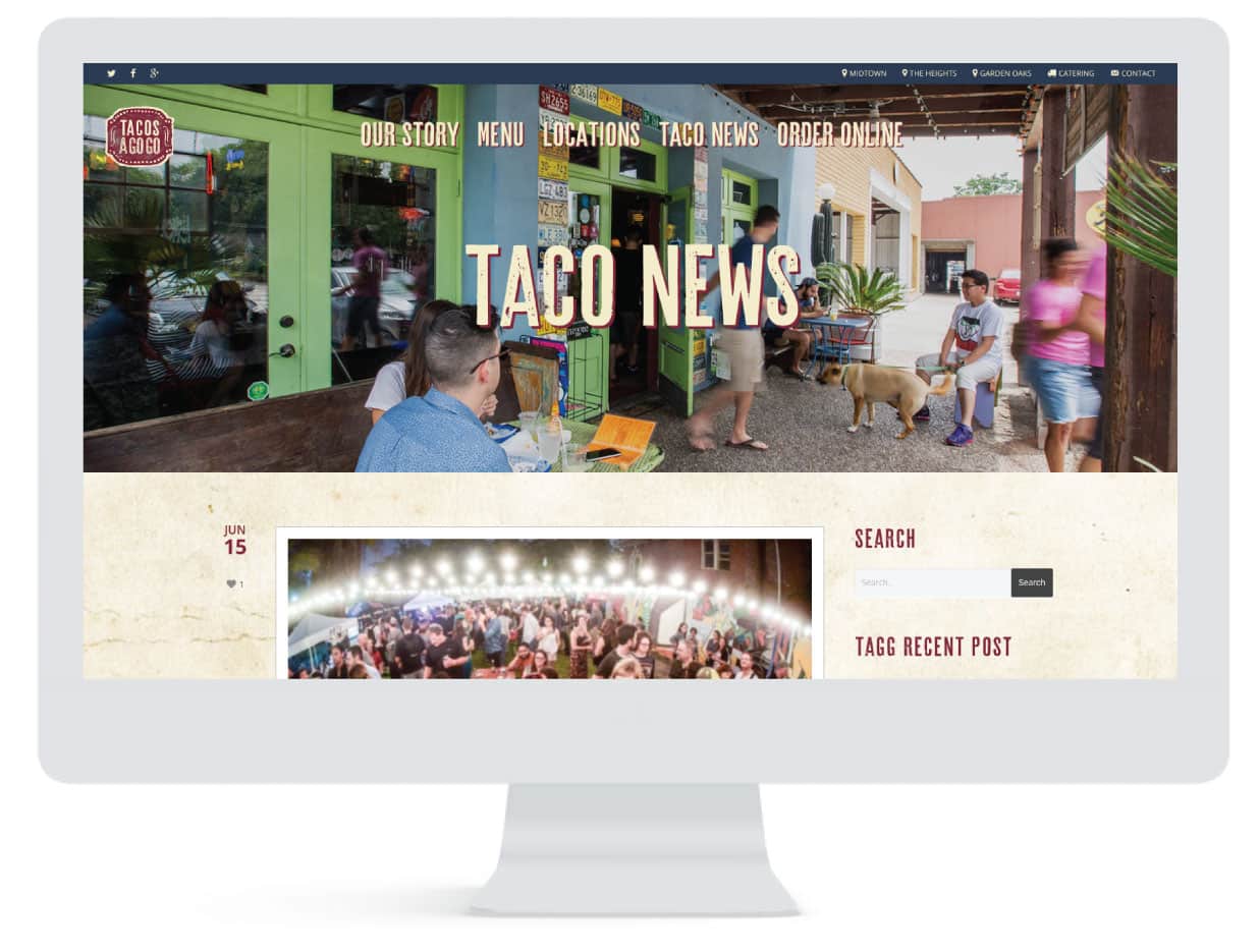
Content Management System
Tacos A Go Go is a brand that is loyal to its roots, with vision beyond their hometown. That’s why Living Proof Creative implemented a way for the website to publish content. Now the brand is able to have a voice that unites there multiple locations. Continuous blog posts and a social media presence expands their brand across Houston and beyond.
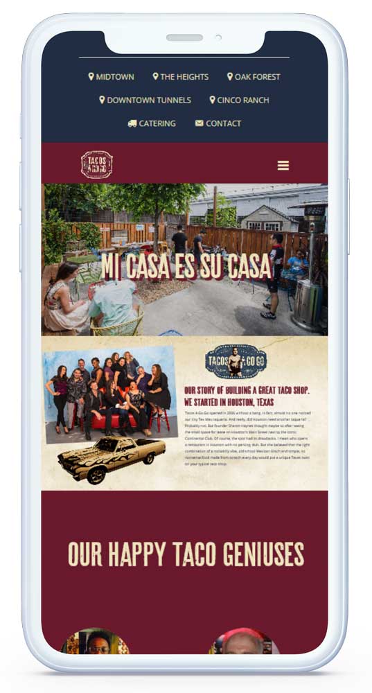
Mobile Responsive
Many users visiting Tacos A Go Go’s website simply want to access the menu. The menu directly affects whether or not they decide to order food. It is the #1 most effective way to create customers. Over 50% of users accesses the menu from their mobile device, so it was imperative that Living Proof Creative design a website and menu that had an adaptive device layout.


