Not many people can claim G.O.A.T. status, but those who can are the “Greatest Of All Time” in their field. Although the acronym is usually associated with exceptional professional athletes, it has also been attributed to musicians and other public figures. So, when debating who deserves the moniker among marketing influencers, Paul Rand tops our list as America’s G.O. A. T. in graphic design. In fact, Steve Jobs, who hired Rand in 1986, once called him “the greatest living graphic designer”.
Paul Rand was an esteemed American graphic designer and art director during the twentieth century. He revolutionized commercial art in American advertising in the 1930s and was responsible for many iconic corporate logos, including IBM, ABC, Yale University, Morningstar Inc, and more. Influenced by the Swiss-style of graphic design, Rand showed the world that it can, and should, be both beautiful and functional – changing America’s opinion on visual communication. He was a design trailblazer and an icon, and his work still influences the industry today.
Brief History of Paul Rand
Born Peretz Rosenbaum in 1914, in Brooklyn, NY, Rand’s creativity emerged at a very young age through signs he designed and painted for both his father’s grocery store and school events. His creativity was not actively encouraged by his Orthodox Jewish family, so he fed his passion by studying the works of Cassandre and Moholy-Nagy from European magazines like Gebrauchsgraphik.
Paul Rand’s Early Years - Birth of a Creative
Paul’s father enrolled him in Herron High School, noted for its vocational programming, as he felt it would provide a better foundation for a future career. However, he also allowed Paul to attend the Pratt school at night, igniting a design passion that would not diminish. After high school, Rand continued his creative studies and attended several art schools, including The New School for Design, the Art Students League, and Yale University in Connecticut.
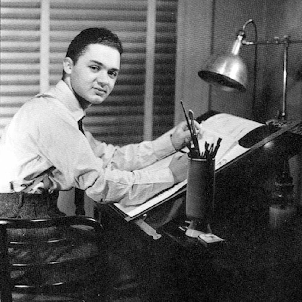
Start of Paul Rand’s Career
Rand’s professional career began small with a part-time position creating stock images for a service that supplied graphics to various newspapers and magazines. However, this work and his class assignments allowed him to amass a sizeable portfolio which helped him land bigger and bigger projects.
Around this time, Rand decided to change his given name, Peretz Rosenbaum, and adopt something more “Madison-Avenue friendly”. His selection, Paul Rand, intentionally contained four letters in each name, which he felt represented symmetry and symbolism. Many think this name was his first successful corporate identity, as it would come to represent the now-iconic “Paul Rand Graphic Design” style.
Prior to creating some of the most recognizable Paul Rand logos and corporate identities in marketing history, Rand began his rise to fame designing magazine covers as art director for Esquire-Coronet magazines. While there, he also freelanced for other publications, like Direction magazine. His work for Direction was pro-bono in exchange for artistic freedom, which allowed him to produce the notable works that helped establish his reputation as a preeminent graphic designer while ushering in the era of Paul Rand design.
Involvement in Corporate World
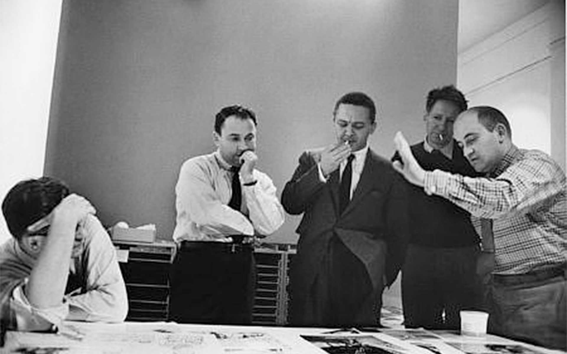
A few years after joining Esquire, a senior executive, William Weintraub, sold all his shares and left the company to start an advertising agency. He offered Rand the position of chief art director, which Paul readily accepted.
Rand ruled with autonomy and was almost solely responsible for the ideas and artwork produced at the agency. Although he was too exacting in his standards to delegate, he honestly evaluated the work his department created and always tried to find a solution to the problems he identified. He was known to be a tough yet excellent teacher and mentor.
His insistence on signing his work helped establish Rand’s career, as his name and style became widely recognizable for embracing wit and humor, often including friendly hand-drawn characters and bold, arresting colors. He was marrying art and commercial and establishing a new era for advertising as art that embraced form and function over the copy.
Paul Rand graphic design became so popular that it was recognizable without his signatures, and he elevated the art of graphic design to new levels. “Anyone designing in the 1950s and 1960s owed much to Rand, who largely made it possible for us to work. He, more than anyone else, made the profession reputable. We went from being commercial artists to being graphic designers largely on his merits,” explains design veteran Louis Danziger.
The Peak - Top Corporate Projects
Rand’s philosophy that design was an effective tool for business helped him create corporate logos that later became responsible for much of his notoriety. At that time, logos were typically placed at the base of an advertisement without much thought. Not so for Pual Rand logos. He developed logo designs that became illustrative features or a character – and in many cases, an icon. He famously created simple, creatively impactful logos for an impressive roster of companies, including ABC, Cummins Engine, Ford, UPS, NeXT, and IBM – the latter of which is still used today.
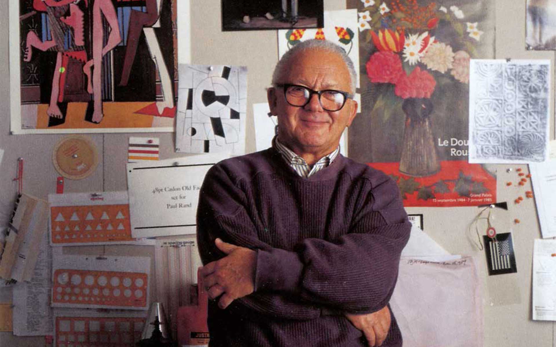
Paul Rand’s Final Years

In addition to art direction, Rand also taught graphic design at Yale University and published several crucial writings on design. He remained vital as he aged, producing important corporate identities into the 80s and 90s with a rumored $100,000 price per single design. Paul Rand died at 82 years old in 1996, leaving behind his memoirs and a legacy of work.
Paul Rand’s Logos
Considered the brand name for corporate logo designs for decades, Paul Rand logos are recognizable even today. He was revered for producing logo designs that communicated a clear message to the viewer by combining recognizable symbols and text in eye-catching yet straightforward and memorable ways. Here are some of the most popular and iconic Paul Rand design logos created during his career.

In 1961, Rand transformed their out-of-date “shield” logo into a modern image by simplifying the shield design, placing a package over it, and using lower case letters.

Rand added stripes to the IBM logo in 1972 as a half-toning technique to make the mark slightly less heavy and more dynamic.

The company’s name was inspired by the last line of Thoreau’s Walden, “The sun is but a morning star,” which Rand expressed with a rising sun in place of the “o” in Morningstar.

This logo mimics the symbols used to draw electrical diagrams and circuit boards, which emphasizes the company’s innovations in electrical power while giving the logo a modern and technological look.

Rand’s last logo of his career signified the company name with the big ‘E’ while also embodying the ideas of household power (with a plug), industrial power (with stacks or towers), and connectivity between the E and N.

The ABC logo effectively uses negative space and brilliantly conveys a clear message to the network’s massive audience.
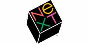
Apple logo designer Pual Rand disassociated the company’s name (Next) with the word “exit” by including an “e” in lower-case among the upper-case characters, explaining that it gives a new rhythm to the letters and allows readers to see the word as it actually is.

Although never officially adopted, Rand’s version of the Ford logo was an updated version meant to suggest strength, speed, efficiency, and utility.

The Atlas logo design uses the triangle as an abstract shape and a letter form. The triangle symbolizes precision and strength, while the letter “A” symbolizes priority and quality.

Rand developed this distinctive, memorable, and clear logo with bright colors to represent the quality of the company’s printing.

Color and nature symbolize the serenity of the community.

Rand’s use of flags communicates the international focus of this software company, while the typeface evokes a modern feel.
Design Principles by Paul Rand
Paul Rand’s design principles continue to inspire the process today. Rand often philosophized on what logos are, what they are not, what they are capable of being. Essentially, for Paul Rand, everything is design. Let’s break down a few of the quintessential principles born of Paul Rand’s thoughts on design.
“Design is the silent ambassador of your brand.”
All of the design elements, such as colors, layout, and font, work together to represent a brand in a positive light and help increase brand awareness and sales. The design elements in your logo and design can and should communicate on many levels.
“A logo derives meaning from the quality of the thing it symbolizes, not the other way around.”
A logo design will not make or break the business, and Rand explains this best by saying, “It is only by association with a product, a service, a business, or a corporation that a logo takes on any real meaning. If a company is second rate, the logo will eventually be perceived as second rate. It is foolhardy to believe that a logo will do its job immediately, before an audience has been properly conditioned.”
“The only mandate in logo design is that they be distinctive, memorable and clear.”
By saying this, Rand removes any responsibility of a logo to depict anything about what the company actually does. As long as the logo is distinctive, memorable, and clear, it will serve the company well.
“Simplicity is not the goal. It is the by-product of a good idea and modest expectations.”
When you understand the limits of a logo – i.e., what it can and cannot do – and avoid overthinking the design, your result will do its job.
"Presentation is key"
Rand placed a great deal of importance on presentation with his clients, and he told the story of the design journey to convey the result. The presentation should include explaining a design to a client and how it might explain itself to the consumer.
Famous Paul Rand’s Design Quotes
“Design can be art. Design can be aesthetics. Design is so simple, that’s why it is so complicated.”
“Everything is design. Everything!”
“Don’t try to be original; just try to be good.”
“Good design doesn’t date. Bad design does.”
“All art is relationships, all art. Design is relationships. Design in a relationship between form and content… Your glasses are round. Your collar is diagonal. These are relationships. Your mouth is an oval. Your nose is a triangle — this is what design is.”
“Providing, meaning to a mass of unrelated needs, ideas, words and pictures — it is the designer’s job to select and fit this material together and make it interesting.”
“In essence, it is not what it looks like, but what it does that defines a symbol.”
“Visual communications of any kind, whether persuasive or informative, from billboards to birth announcements, should be seen as the embodiment of form and function: the integration of the beautiful and the useful.”
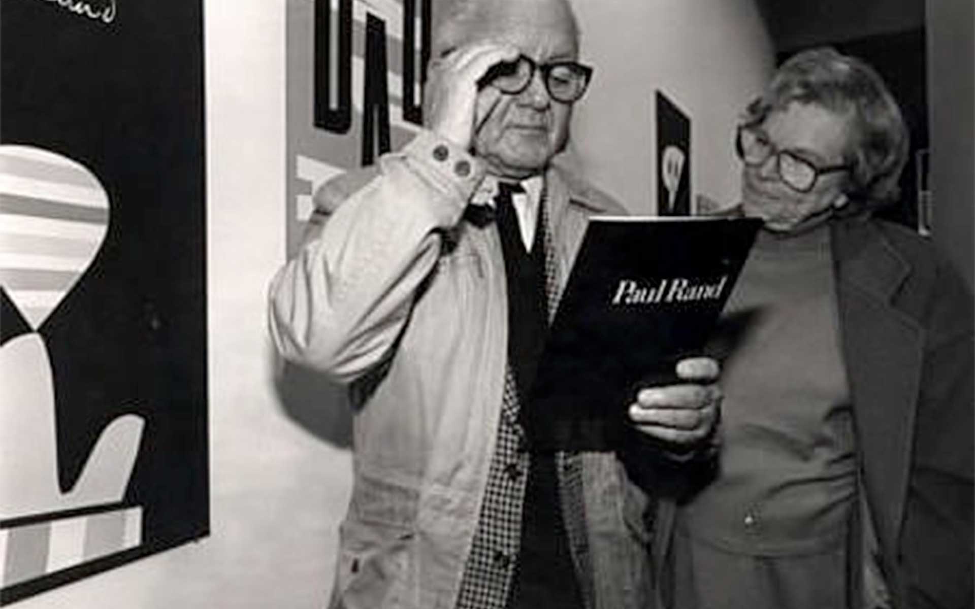
Books on Paul Rand
Paul Rand wrote several books in his lifetime, and others also wrote about the significance of his works in modern graphic design. Following are key reads in the study of Paul Rand thoughts on design and his career, philosophies, and impressions.
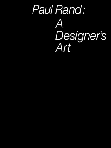
Paul Rand: A Designer’s Art
Perhaps one of the most important writing works, this book is a comprehensive collection of Paul Rand’s most significant and best-known designs, including unique insights into his design process and theory. It is inarguably a must-read for anyone interested in modern design.
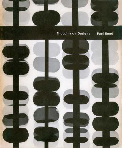
Thoughts on Design
Written at the height of his career, Rand discusses and expounds on his pioneering vision that all design should seamlessly integrate form and function.
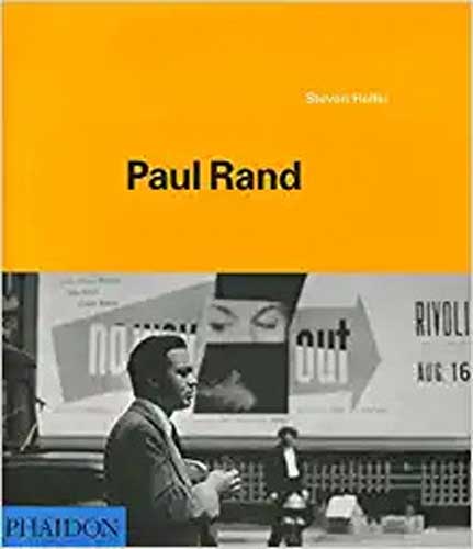
Paul Rand
Written by Steven Heller, this book includes insight into Rand’s works during his advertising, publishing, and corporate identity work by Heller and industry contributors Armin Hofmann, George Lois, and Jessica Helfand.
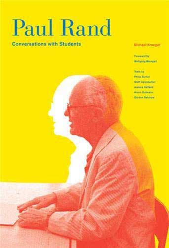
Paul Rand: Conversations with Students
This book, written by Michael Kroeger, shares Rand’s words and thoughts on varied topics ranging from design philosophy to design education while showcasing his ability to discuss his trade with insight and humor. It details Rand’s last interview, recorded at Arizona State University one year before his death in 1996.
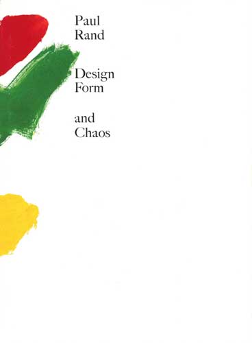
Design, Form, and Chaos
This book, written by Paul Rand, was first published to critical acclaim in 1993. It explores graphic design challenges like the values behind aesthetics, the role of intuition, selecting a typeface, and the place of market research – while elegantly demonstrating how utility and beauty can effectively combine.
Hopefully, you enjoyed learning about one of last century’s most creative and brilliant minds. The effect of Paul Rand’s designer philosophies and storied career in the marketing industry is undeniable. If you are ready to move your company forward with cutting-edge branding and marketing that can withstand the test of time and give you an edge over your competition, contact us at Living Proof Creative today.
All images are sourced from paulrand.design