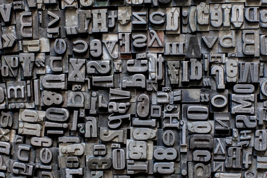
Creating a website that shines across all devices can feel like you’re trying to hit a bullseye in the dark. You want it to dazzle everyone, whether they’re swiping on their iPhone, navigating on a tablet, or clicking through on their desktop.
We’ve all faced those moments – straining our eyes and patience as we tweak and adjust, hoping our web design remains intact and appealing across various screen sizes. It’s like chasing an elusive target..and believe me, that frustration is all too familiar.
After embarking on a quest for answers and sifting through the vast sea of information out there, we stumbled upon some game-changing strategies. Turns out, responsive web design goes beyond just squeezing content into different-sized screens; it’s about crafting seamless experiences that delight users regardless of how they’re accessing your site.
This blog aims to illuminate your path toward mastering responsive design—from grasping its foundational concepts to mastering the art of multi-device testing. Excited for some enlightenment? Let’s dive in!
Key Takeaways
- Responsive web design lets websites change to fit any screen, big or small. It uses CSS media queries and other tools to make sure everything looks good on different devices.
- Ethan Marcotte introduced responsive web design in 2010. Since then, Google has made mobile-friendly sites a priority. Tools like Bootstrap help developers build adaptable websites quickly.
- For the best user experience, pay attention to details like defining viewports, optimizing images and text for readability, and ensuring menus are easy to navigate across all devices.
- Testing on multiple devices is key for making sure a website works well everywhere. Using data analytics helps prioritize which devices to test first. Tools like Chrome Developer Tools can simulate different screens for faster testing.
- Making data tables responsive involves techniques such as converting rows into block elements or hiding less important columns on smaller screens to keep information clear and accessible.
Understanding Responsive Web Design

Responsive web design is like magic for websites. It lets them change size and shape to fit any screen, big or small. Imagine pulling up a website on your smartphone, tablet, or desktop and it looks perfect every time—that’s responsive design at work.
We make sure our sites can do this because everyone deserves a great viewing experience, no matter the device.
This approach solves a huge puzzle in today’s online world. With so many different devices out there—iPhones, Android tablets, laptops—you name it; crafting websites that work everywhere is crucial.
We use CSS media queries to help with this. These are like little instructions that tell the website how to behave when someone views it on different screens. So whether you’re scrolling through pages on a tiny phone or clicking around on a massive desktop monitor, everything looks clean and user-friendly.
Evolution of Responsive Design

Ethan Marcotte rocked our world in 2010 with his game-changing article on Responsive Web Design. Suddenly, web developers saw a new path forward. Marcotte’s vision brought the idea of fluid layouts, media queries, and flexible images into the mainstream.
We embraced this as our mantra for creating websites that adapt seamlessly across various devices. This wasn’t just about making sites look pretty on mobile browsers or desktops; it was a strategic shift towards accessibility and usability.
Google stepped in, upping the ante by prioritizing mobile-friendly websites in search results. This move sent a clear message: responsive design is not an option; it’s essential for anyone who wants to stay visible online.
With tools like Bootstrap promoting a mobile-first approach, we quickly jumped on board, realizing speedier development times without sacrificing code quality or user experience. Our journey through responsive design evolution showed us that adapting to user needs isn’t just smart—it’s imperative for survival in today’s fast-paced digital landscape.
Key Elements of Responsive Design

In mastering responsive web design, we dive deep into elements like defining viewports and optimizing images.. each step is meticulously crafted to ensure your website shines on every device.
Keep reading, as there’s so much more we’re eager to share with you.
Defining a Viewport
A viewport is the user’s visible area of a web page. It changes with each device, affected by varying screen sizes and resolutions. Understanding this concept guides us in creating responsive designs that adapt seamlessly across different devices.
We recognize its importance as modern users access the internet using a myriad of devices, from smartphones to large desktop monitors.
We use fluid design principles, born in the late 1990s, to ensure our content looks great on any screen size. By specifying dimensions in percentages relative to the viewport, we enable elements on a webpage to adjust according to the viewing environment.
This approach takes into account over 9000 mobile devices on today’s market, each with their own dimensions and graphics processing capabilities. Our commitment lies in crafting web pages that render beautifully and function perfectly across all these variations.
Utilizing CSS Media Queries
We harness the power of CSS media queries to craft web pages that seamlessly adjust their layout based on device width and orientation. This technique ensures your site looks great whether it’s being viewed on a massive desktop monitor or a compact smartphone screen.
By detecting the viewport dimensions, we tailor each element to provide an optimal browsing experience, eliminating horizontal scrolling and distorted images.
Our strategy involves specifying different styles for various screen sizes. Say goodbye to pinching and zooming on small screens! We implement breakpoints where content naturally shifts layout, making sure text is readable without adjustment and images scale properly.
It’s like having a custom-designed webpage for every device out there—ensuring users engage with your content in the most comfortable way possible.
Optimizing Text
Optimizing text is essential in responsive web design. We ensure that the font size adjusts beautifully across devices. This adaptation prevents squinting on small screens and guarantees readability without zooming.
Our use of CSS3 brings this vision to life, enhancing user experience drastically.
Beyond just adjusting sizes, we prioritize legibility and accessibility. Text contrast becomes a focus, making sure that it’s easily readable against its background — no matter the device or lighting conditions.
With these strategies, we transform browsing into a seamless activity for everyone.
Implementing Responsive Images
We make sure our websites adapt to any screen by using responsive images. This means your photos look great whether someone’s viewing on a big desktop monitor or a small phone screen.
We code in ways that allow images to resize and shift, ensuring fast loading times and crisp visuals regardless of the device.
To achieve this, we employ HTML elements like the img tag with attributes designed for responsiveness. Techniques such as specifying different image versions for various screen widths help us optimize web performance.
Our goal is clear – no more squinting at tiny images or waiting forever for a page to load on mobile devices.
Adapting Data Tables
Responsive web design is the cornerstone of a seamless digital experience across all devices. Ensuring that data tables adapt smoothly to various screen sizes is crucial in this endeavor.
- Converting Rows into Multi-Line Elements: This technique involves restructuring each row of the table so it becomes a block element. On smaller screens, this allows the information to stack vertically, improving readability and interaction on devices like smartphones and tablets.
- Hiding Columns with User Consent: We sometimes hide less critical columns to make tables fit better on smaller screens. Then, we provide a button or link that lets users choose to view these additional columns if they need them. This approach respects user choice and keeps interfaces clean.
- Utilizing Horizontal Scrolling: For complex tables where data reduction isn’t an option, implementing horizontal scrolling can be a lifesaver. This ensures that every piece of data remains accessible, no matter the device’s screen size.
- Implementing Responsive Design Libraries: Libraries like jQuery DataTables come equipped with responsive design features that automatically adjust table layouts based on the browsing environment. They save us time and ensure consistency across different parts of a web application.
- Creating Custom Breakpoints for Tables: We define specific breakpoints in our CSS where our tables will change their layout to better fit different screen sizes. These are determined by analyzing usage data and understanding at which points users struggle with table content.
Navigating Menus
Menus play a key role in how users interact with websites on different devices. We make sure they’re easy to tap on a touchscreen and simple to click through using a mouse or keyboard.
Our approach involves designing dropdowns and fly-out menus that adapt smoothly whether you’re swiping on a phone, clicking with a mouse, or navigating via screen reader technologies.
We focus on creating menus that are intuitive for everyone, considering factors like the size of menu items and ease of access across devices. This ensures that no matter if the user is browsing on an iPad, Android smartphone, or Windows laptop, the experience remains seamless.
By prioritizing usability testing and leveraging analytics, we refine our navigation designs to meet the evolving needs of all users – making every interaction straightforward and frustration-free.
Starting with Responsive Design

Jumping into responsive design, we quickly realize it’s our gateway to creating web experiences that truly resonate across devices. It’s about laying a solid foundation—ensuring every user, regardless of their device, gets the best version of your site.
Bootstrap
We love Bootstrap for its mobile-first approach. It makes building responsive websites fast and efficient. This framework comes packed with HTML, CSS, and JavaScript libraries. What sets it apart is the starter template—it includes a viewport tag and utilizes a 12-grid layout.
These features help in organizing DOM elements effectively.
Bootstrap simplifies web designs while ensuring they are fully responsive across all devices. Whether you’re tackling a mobile app or a desktop version, this tool adjusts your site to fit perfectly on any screen size.
It streamlines the development process so we can focus more on creating stunning visuals and less on complex coding challenges.
Pre-Designed Responsive Templates
Wix and W3Schools offer a treasure trove of pre-designed responsive templates. These gems allow anyone, even without design chops, to modify and create stunning websites. They’re crafted with care to adapt seamlessly across various screen sizes and devices.
It’s like magic – your site looks fantastic everywhere, from a phone to a desktop.
Bootstrap kicks it up a notch by pushing a mobile-first approach. This means using these templates through Bootstrap makes the process not just easy but aligned with today’s web browsing trends.
Imagine crafting responsive websites swiftly without getting tangled in complex coding. That’s the power we harness with these tools – simplicity meets sophistication.
Techniques for Multi-Device Testing

We dive into cutting-edge techniques for multi-device testing, ensuring your web design shines on every screen. Our tested strategies streamline the process, making it easier and more efficient for you to deliver standout responsive designs.
Prioritizing Devices
We know that making sure websites look great on different devices is key. That’s why we focus on picking which devices to test first, based on real data and how our users visit our sites.
- Check the analytics: This is our first step. Analytics show us which browsers and devices most of our visitors use. If most of our traffic comes from Chrome on Android phones, that’s where we start.
- Group by popularity: After identifying the top browsers and devices, we group them into tiers. The most used ones form our priority group for immediate testing.
- Consider operating systems: It’s not just about the device but also the operating system. We make sure to include a mix of iOS, Android, Windows Phone, and others in our testing plan.
- Factor in form factors: Phones, tablets, desktops—each has its own screen size and resolution. We prioritize across all form factors to ensure broad compatibility.
- Don’t forget emerging devices: Trends change fast. New devices gain popularity quickly, so we keep an eye on market movements and prepare to adjust our priorities accordingly.
- Use segmentation wisely: Not all users are the same; some might use older versions of Internet Explorer or Safari on a MacBook Pro from 2012. Segmenting these groups helps us target specific problems more accurately.
Devising a New Testing Strategy
Creating a robust testing strategy is crucial for ensuring our websites shine on every device. Let’s dive into how we can craft a plan that puts user experience front and center, leveraging analytics to drive our decisions.
Analyze user traffic data:
Start by looking at which devices bring the most visitors to your website. This helps us prioritize testing based on actual user behavior, ensuring we focus our efforts where they matter most.
Categorize devices into groups:
With data in hand, we organize devices into priority groups. Group 1 should cover devices used by more than half of our audience, making it clear where to direct initial testing efforts.
Consider audience specifics:
Understanding that different groups may use different browser and device combinations is key. Age, class, global distribution, and engagement time all influence how people interact with our site—these factors guide our testing priorities too.
Choose relevant testing tools:
Tools like Chrome Developer Tools, BrowserStack Responsive Tool, and Responsive Test by DesignModo become invaluable. They simulate various environments without needing physical devices for each test case.
Implement test-driven development:
By integrating responsive design considerations from the start, we make adaptations more manageable. Incorporating this approach ensures our designs are flexible from the get-go.
Regularly review analytics:
User trends change; so should our testing strategy. Regular reviews of analytics ensure we stay ahead of shifts in device usage and maintain optimal site performance across platforms.
Embrace automation where possible:
Manual testing has its place but automating repetitive tasks speeds up the process significantly. Selenium or other automation tools reduce manual effort, allowing us to focus on complex testing scenarios.
Prioritize performance testing:
Speed is crucial for keeping users engaged—especially on mobile devices. Utilizing tools like PageSpeed Insights identifies bottlenecks that could lead to a poor user experience.
Include accessibility in your strategy:
Ensuring websites work well with assistive technologies broadens your reach and boosts inclusivity—important markers for any modern web application.
Think beyond screen sizes:
Responsive design isn’t just about fitting content on screens—it’s about creating seamless interactions regardless of device specifics like network strength or input method (touch vs mouse).
Utilizing Testing Tools: Chrome Developer Tools, Responsive Test by DesignModo, BrowserStack Responsive Tool
We understand the importance of responsive web design in today’s multi-device world. Testing across various devices can seem overwhelming, but with the right tools, it becomes manageable and efficient. Here’s how we make use of testing tools to ensure our designs look great on any screen.
- Chrome Developer Tools: This is a powerhouse for web designers and developers alike. With Chrome Developer Tools, we can simulate our website on multiple device screens without needing the physical devices. It’s as simple as right-clicking on a webpage, selecting “Inspect,” and then clicking on the device toolbar to choose from a range of screen sizes. This tool helps us quickly identify layout issues and make real-time adjustments. We also take advantage of its network emulation feature to see how our sites perform under different internet speed conditions.
- Responsive Test by DesignModo: When we need to check our website’s responsiveness at a glance across different sizes, Responsive Test by DesignModo is our go-to tool. It allows us to view our site in multiple viewport dimensions side-by-side. This visual comparison speeds up our testing process significantly. We can easily switch between portrait and landscape orientations, helping us ensure that every element scales smoothly regardless of the orientation.
- BrowserStack Responsive Tool: For a more comprehensive testing environment, BrowserStack Responsive Tool steps in. It gives us access to real devices running different operating systems like iOS 7, Android’s latest versions, and even Blackberry 10 and Nokia’s OS versions. This ensures that we’re not just simulating but actually seeing how our designs perform in the wild. BrowserStack supports manual and automated test scripts which are fantastic for both quick checks and in-depth testing strategies mentioned, like smoke testing for major browser updates.
Conclusion

Responsive web design truly shapes how we engage with the digital world. It ensures our websites look great and work well, no matter what device we’re using. Through prioritizing devices, optimizing elements like images and menus, and employing powerful testing tools, we can create seamless user experiences.
This approach not only saves time but also guarantees efficiency in reaching a wider audience effectively. Embracing these techniques brings us closer to crafting digital spaces that are versatile, welcoming, and accessible for everyone.
Let’s push forward, making the web a more responsive place for all.
Frequently Asked Questions
1. What is a responsive web design, and why does my website need it?
Responsive web design makes sure your site looks great on all devices—phones, tablets, and desktops. It uses a mix of flexible grids and layouts so your site adjusts to any screen size. This means everyone who visits your site gets a fantastic experience, no matter what device they’re using.
2. How do I test my website across different devices?
Start by using emulators and simulators to mimic various devices like phablets, Blackberry phones, or even Opera Mini browsers. These tools let you see how your site appears on different screens without needing the physical devices. For an extra layer of accuracy, try testing on real hardware too—this way you catch issues that software might miss.
3. Can automated testing help with multi-device testing?
Yes! Automated test automation saves time by quickly checking how well your website works across multiple browsers like Google Chrome, Mozilla Firefox, and Microsoft Edge—all at once. It’s like having superpowers for spotting glitches in pixels or browser wars before anyone else does.
4. Why is mobile-first design important for responsive websites?
Designing with mobile-first in mind ensures that users on smaller screens have just as good an experience as those on larger ones. Since more people browse the web on their phones now than ever before—it’s crucial! Plus, focusing on mobile helps improve load times and boosts overall performance.
5. Are there specific techniques for ensuring privacy while conducting these tests?
Absolutely! Always use open-source software when possible to avoid unnecessary cookies tracking user data during tests… And remember: respecting user privacy isn’t just nice; it’s essential for building trust and keeping loyal visitors coming back.
6. How can I make sure my content looks perfect in landscape-oriented views as well as portrait mode?
Use CSS media queries to adjust stylesheets based on the orientation of the device viewing your page… This technique lets you tailor font sizes, image alignment—and more—to look just right whether someone’s holding their phone upright or sideways.

